## You only need to install packages once (as long as you do not update your R version):
install.packages("tidyverse") # Makes data manipulation easier
install.packages("sf") # Handles Spatial Objects
install.packages("geodata") # Helps download spatial data
install.packages("mapme.biodiversity",dependencies=T) # The core of this tutorialUsing mapme.biodiversity for conflict analysis
Overview
In this tutorial, we want to learn how to construct a spatial dataset for conflict analysis using the mapme.biodiversity package. While a little background knowledge in R and spatial data is helpful, we will go through all steps slowly and with detailed explanation. So don’t worry - in the end you’ll be able to replicate the steps we take here, and adjust them to your very own research question.
This tutorial is meant both for advanced as well as inexperienced R users. The main text focuses on the replicable code that you can use for your research, while all sections include lots of additional on-demand details explaining our code chunks for less experienced users.
Our tutorial will go through the following steps:
General Introduction: Here we will discuss the basics of R and geodata. If you are already familiar with packages and functions in R you can very well skip over this section and start with “Introductory Example: Iraq”. Just make sure to adopt the code snippets for your own code so that the required packages are loaded.
mapme.biodiversity Workflow: In this section, we will go through one example for a conflict analysis based on Iraq. We will draw all data from the mapme.biodiversity package, and analyze based on UCDP conflict event data how civil conflict in Iraq progressed over the years. Finally, we will empirically analyze what geographic characteristics correlate with conflict incidence.
Getting Started
Introduction to R packages, objects, and functions
How does R tick?
When we work in R, we basically do the same thing over and over again: we use functions to create or manipulate objects. There are many types of objects, and we will talk about some of them.
Note that most user interfaces like RStudio allow you to either type commands in the command prompt to execute them directly, or to develop a script where you collect all commands (with a good commentary) and execute them from there. We highly recommend you to work with scripts where you develop the full workflow from reading the data to finishing your analysis. This will make your coding transparent, allow you (and your co-authors) to revisit and adjust coding steps, and make it much easier to find coding mistakes. It is therefore recommendable to use the command prompt only for testing and checking things while working on a full workflow in the script.
The simplest objects are scalars (i.e. single numbers or letters), which we can combine into vectors (arrays of numbers or letters). We can then combine vectors to a matrix, which is a combination of line- and row-vectors. Commonly, we will use matrices with some nice extra attributes. R calls them data frames. While data frames follow the same intuition as matrices by having rows and columns, they provide much more flexibility for coding. Most importantly, they allow you to store different vector classes together. For example, you can have a numeric column and a character column in the same data frame object. A matrix on the other hand forces you to convert all columns to only one class, e.g. character. In our workflow below we use a specific type of them called simple features. These will be the basic building block of our analysis.
We can apply all sorts of different functions on all sorts of objects. You will recognize functions from the parentheses. For example, summary() is a function which wants you to name an object inside the parentheses. There are a lot of functions that R already knows when you install it. Still, users keep writing many more functions for specific use cases. One of these use cases is working with spatial data. For this, we will need a number of additional functions, which we can “teach” our R session by loading packages.
Packages
Whenever you start an R Script to work on a project, one of the first things you’ll want to do is read the packages you want to use in this project.
If you want to use a package for the first time (or after you update/re-install your R version) you will have to install it first. This works with the install.packages() function, where you put a string with the package’s name in the parentheses. After a package is installed, you can load it at the beginning of every R session with the library() command.
Let’s start our R session by loading the necessary packages. We will need the mapme.biodiversity package for our spatial data project to use the wealth of data generated by the mapme.biodiversity project. In addition, we will be using a lot of functions from the tidyverse and sf packages. Finally, the geodata package will help us access additional geodata that we will need to create our dataset.
## Yet, you'll need to call the packages each time you start a new session:
library(tidyverse)
library(sf)
library(mapme.biodiversity)
library(geodata)
More on the packages we are using
You now enriched your R session by hundreds of new functions. Let’s quickly go through the packages we just loaded and see why we need them:
The tidyverse package is actually a collection of packages which include a large number of functions that make data wrangling in R easier. It is totally possible to reproduce our workflow below without any functions from the tidyverse package. However, tidyverse includes so many convenience functions that it comes close to a totally new syntax within R which is often much more intuitive. Other than introducing new functions like select(), filter(), or mutate() which save us a lot of typing, the tidyverse also includes the ggplot package that allows us to make nice maps and graphs. In addition, the tidyverse allows us to use pipes (%>%). Piping allows us to call several functions one after the other, without all the time specifying anew which object we are working with.
The sf package introduces a number of functions and new object types which provide the infrastructure for working with spatial data and using R as a GIS. The name sf is short for “simple features.” We will see below that “simple features” are spatial vector data, i.e. points, lines or polygons that indicate locations and forms in space. The nice thing about the sf package is that it works nicely together with the usual R syntax. This is, we will create simple features below. These are normal datasets (“data frames” in R) with spatial information.
Finally, the geodata package pretty much does what the name says: it includes a number of functions that help us download geodata from the internet. We will here specifically use the gadm() function to download spatial data on countries’ administrative boundaries from the GADM project’s homepage.
Starting your project
With our packages loaded, we are pretty much good to go. Let’s start our R Session by:
- Clearing our Workspace to avoid objects from other projects interfering with our work here.
- Setting the Working Directory to tell R where to find and store your data.
## It is generally good practice to always start your R sessions like this:
rm(list=ls()) # Clean for Workspace
main.wd <- "C:/User/Documents/MapMe" # Define your Working Directory.
#NOTE: Don't forget switching backward-slash (\) to forward slash (/).
setwd(main.wd) # Set the Working Directory.
What does this do?
It makes sense to always start your sessions like this. Clearing your work space is important to make sure that objects from other projects do not interfere with your current one. It is also good practice to define your working directory in the beginning and then only use relative paths in the rest of the script. This will allow you to easily adapt your code when using it on a new computer, and save your colleagues and co-authors a lot of headache when they want to implement your code.
When setting up the script, you already see the combination of functions and objects at play. For example, we use the setwd() function to set our working directory, i.e. tell R where to look for and store the files we want to work with. The function takes the main.wd object that we defined above as a string identifying a folder on our computer as the input. If you are a windows user, remember to switch everything to forward-slash, otherwise R will complain.
Instead of starting your session with emptying your environment and setting the workspace, you can alternatively create an R Project. An R Project provides a fully contained project space for your project, so you do not need to empty your environment. It will also automatically use the working directory where you store the R project. We will work with an R project in the accompanying tutorial for Madagascar conflict data.
Introductory Example: Iraq
To get familiar with conflict data and the mapme.biodiversity workflow, we want to look at an example. In this example, we want to investigate where the main conflict zones are in Iraq, and trace the geographic spread of the “Islamic State (IS)” over time. Finally, we will ask whether certain geographic characteristics determine whether provinces in Iraq witnessed more or less conflict incidents.
We will base our analysis on a spatially aware data frame that identifies the administrative provinces in Iraq. Afterwards, we will use our polygons to collect data associated with them. Specifically, for each spatial unit defined by a province’s boundaries, we will collect information on conflict incidents and other relevant variables within those areas. Then finally, we can use these data for graphical visualization, with provinces as our level of analysis.
Step 1: Get Spatial Polygon Dataset that defines our unit of observation
Our analysis starts out by defining our unit of observation, i.e. the spatial entities for which we want to collect and analyse our variables. In technical terms, we need to get our hands on a spatial vector dataset that defines the spatial units we want to work with.
More on Spatial Vector Data
There are three types of vector data:
- Points, defined by longitude and latitude.
- Lines, connecting two or more points by straight lines.
- Polygons, a convex combination of lines.
When we work with spatial data in R, we want to use either type of these vector data and add to each observation information that is associated with this geographic entity. For example, we could collect a number of points that identify certain locations on the globe, and then add information about the altitude and temperature for each of these very points. Note that an alternative to vector data would be a raster dataset, which we will not discuss here.
For most types of spatial analysis, polygons are the most helpful unit of analysis. There are a number of variables that can hardly be measured with just one point or line in space. For example, how would we think about the population or GDP of just one point on earth? In polygons however, we can measure and aggregate pretty much everything. For example, we can count the number of people in a polygon, get their average income, measure the average temperature and precipitation in that polygon, and so on.
This often involves spatially matching data that come as points, like conflict events, with polygons and then finding the right way of aggregation. We will do this below. If you think about it, almost all data we are confronted with everyday are collected for polygons: the population and GDP counts that e.g. the World Bank publishes for each country is nothing else than the aggregated number of people and incomes that fall within the border (polygons) of each country.
For our Iraq example, let us work with provinces (the first administrative level) as our unit of observation. We could use any other level, or even totally made-up polygons. In the end, it is only important that we supply the mapme.biodiversity package with some sort of polygons for data extraction. Let’s download province-polygons for Iraq from the GADM project.
More on GADM downloads
There are many ways to get polygons on administrative (or other) regions across the world. One option would be to use official data from the country’s statistical office that you want to work with. When you want to work with global datasets however, this can become quite tedious. Luckily, there are mapping projects like the Database of Global Administrative Areas (GADM) which provide collections of countries’ administrative boundaries at different resolutions.
Even better is that we can easily source data from GADM with the gadm() function from the geodata package. This function wants to know three things from us:
- For which country do we want data? You can e.g. provide a country’s ISO3 Code, a standardized 3-digit code that uniquely identifies each country.
- The administrative level for which you want the borders. With
level=1, we get the first level, i.e. provinces. Other levels would be, e.g., the national borders (level=0) or the districts (level=2). Some countries even offer lower resolutions in sub-districts (level=3). - The path to store the data downloaded from GADM. This can just be your working directory.
To find the ISO Code for the country you want to work with, you can use the countrycodes package (note that you’ll have to install it before using it the first time):
library(countrycode)
countrycode("Iraq",origin="country.name",destination="iso3c")
[1] "IRQ"Note that the geodata package is not a direct part of the sf environment with which we will be working afterwards. Therefore, we will have to convert the polygons we get from gadm() to the sf type such that our sf commands can work with it. This is easily done with the st_as_sf() command.
## Use the gadm() function from the geodata package to get administrative boundaries:
mp_sf <- gadm(country="IRQ",level=1,path=main.wd)
 # Convert to an sf object so we can use sf-functions on it:
mp_sf <- st_as_sf(mp_sf)
More on Simple Features
We now have a simple feature that we called mp_sf. You can think of it as a spatially aware data frame. Let’s inspect the object a bit further:
summary(mp_sf) COUNTRY NAME_1 geometry
Length :18 Length :18 MULTIPOLYGON : 1
N.unique : 1 N.unique :18 POLYGON :17
N.blank : 0 N.blank : 0 epsg:4326 : 0
Min.nchar: 4 Min.nchar: 5 +proj=long...: 0
Max.nchar: 4 Max.nchar:15 head(mp_sf)Simple feature collection with 6 features and 2 fields
Geometry type: GEOMETRY
Dimension: XY
Bounding box: xmin: 38.79684 ymin: 29.05857 xmax: 48.56856 ymax: 37.32503
Geodetic CRS: WGS 84
# A tibble: 6 × 3
# Groups: COUNTRY [1]
COUNTRY NAME_1 geometry
<chr> <chr> <GEOMETRY [°]>
1 Iraq Al-Anbar POLYGON ((44.22349 33.25313, 44.22324 33.28643, 44.22412…
2 Iraq Al-Basrah MULTIPOLYGON (((47.92017 30.02874, 47.93154 30.02465, 47…
3 Iraq Al-Muthannia POLYGON ((46.53541 30.56554, 46.5242 30.57467, 46.50055 …
4 Iraq Al-Qadisiyah POLYGON ((45.76847 31.63302, 45.76831 31.6616, 45.75977 …
5 Iraq An-Najaf POLYGON ((44.46421 31.93221, 44.46847 31.95859, 44.47314…
6 Iraq Arbil POLYGON ((43.81506 36.40563, 43.81105 36.4004, 43.81083 …These two functions will help you get an overview. First summary() gives an overview of each variable attached to the data frame, while head() will print the first 6 observations in your console. You could also use the View() function to open the full dataset in a separate window. Either way, you will see that the gadm() command gave us 18 different polygons which will be our unit of observation. For these 18 observations, we already have some variables attached to it right away.
The most important variable for us in the beginning is the very last variable, called geometry. This one variable holds all the spatial information R needs to identify each of Iraq’s provinces as a spatial entity. You see that the geometry variable identifies each observation as a POLYGON and contains the exact point coordinates that each polygon is made of.
We also see that gadm() delivered a number of other variables, i.e. certain part of information that are associated with each single one of our polygons. These additional variables basically give us the names (and some IDs) for each of the polygons. For example, we see that the first observation is the “Al-Anbar” province in the country of Iraq.
Since we are working with spatial data, there is an even more convenient way to get to know our data - we can just plot and inspect them! It is easy to quickly visualize spatial data with the plot() command. Note that we use the function st_geometry() to let R know that we only want to plot the boundaries and not visualize any of the data attached to the dataset (you can try yourself what happens if you do not include the st_geometry() function):
plot(st_geometry(mp_sf))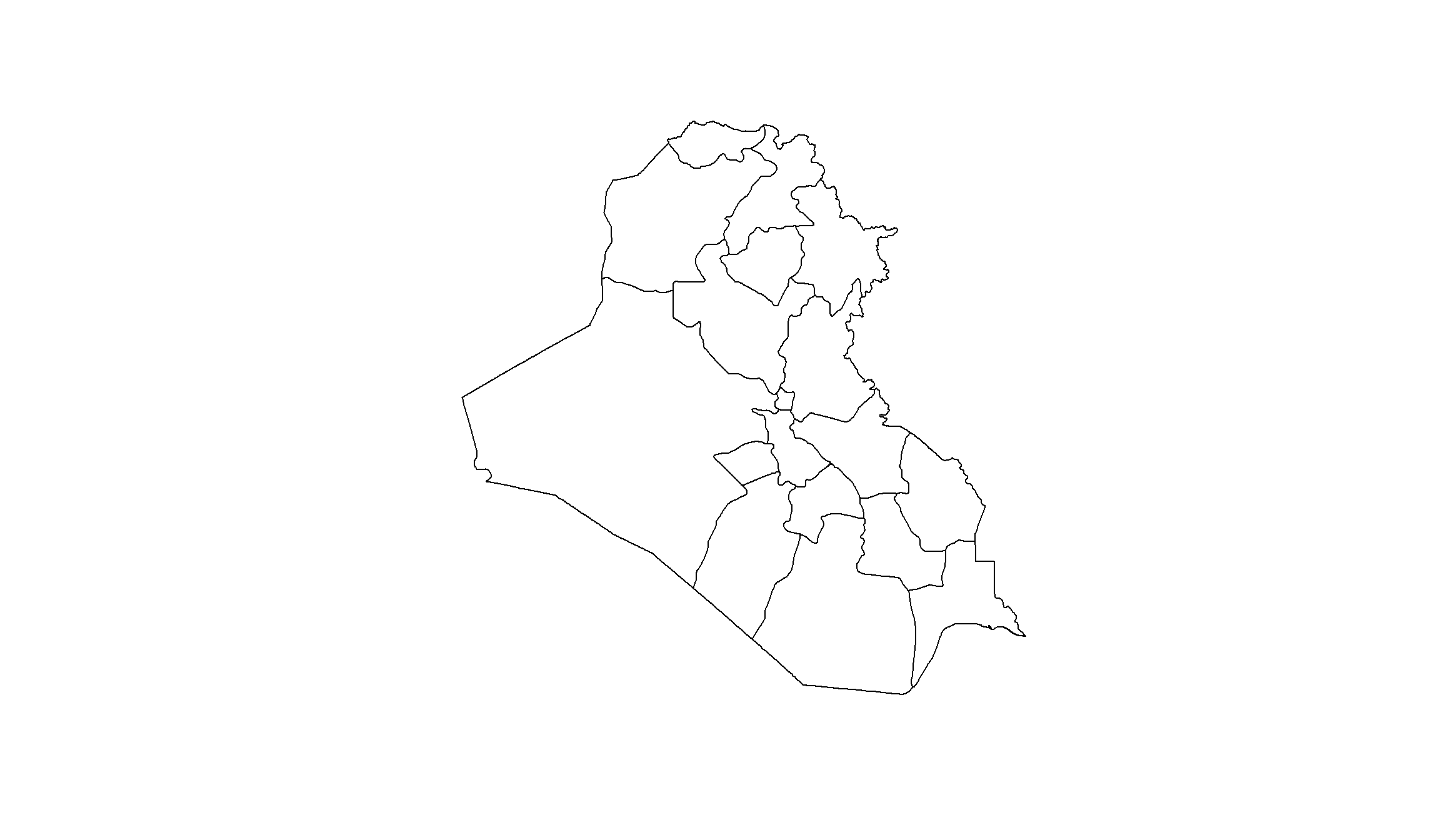
This map very well illustrates the level of observations on which we will base our study. Now, it’s time to enrich our polygons with data for the analysis.
Step 2: Collect the data from mapme.biodiversity
The hardest part of an empirical analysis comes before the actual analysis - the collection of a dataset. Our goal is to investigate the conflict trajectories in Iraq, and analyze what local characteristics correlate with conflict incidence. This means that we want to collect a dataset that tells us, for each of Iraq’s provinces, how many conflict-related fatalities occurred, together with a number of potential local explanatory variables.
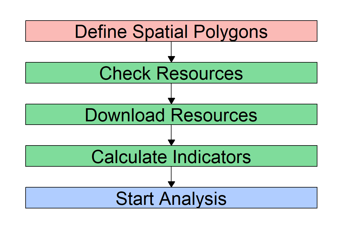
Here comes the power of the mapme.biodiversity package. Instead of downloading and matching all the data ourselves, we can use just a couple of functions to let mapme.biodiversity do the work for us. Whenever you want to collect a new dataset using mapme.biodiversity, you’ll have to go through the same simple steps. You can, of course, just use the code we develop here and adjust it, e.g. by downloading different polygons as the unit of analysis, or by selecting different indicators from mapme.biodiversity below.
The mapme.biodiversity workflow follows a couple of steps that you need to go through one by one:
To get data from mapme.biodiversity, we first need to figure out what variables we actually want. mapme.biodiversity includes a number of indicators from different original sources. Which ones are these? The available_resources() function returns a data.frame with all the resources currently available in mapme.biodiversity. To view all available indicators, we wrap the function with the print() function. Otherwise, R would only show us the first 10 indicators.
print(available_resources(), n=30)# A tibble: 35 × 5
name description licence source type
<chr> <chr> <chr> <chr> <chr>
1 accessibility_2000 Accessibility data for… See JR… https… rast…
2 acled Armed Conflict Locatio… Visit … Visit… vect…
3 biodiversity_intactness_index Biodiversity Intactnes… CC-BY-… https… rast…
4 chelsa Climatologies at High … Unknow… https… rast…
5 chirps Climate Hazards Group … CC - u… https… rast…
6 esalandcover Copernicus Land Monito… CC-BY … https… rast…
7 fritz_et_al Drivers of deforestati… CC-BY … https… rast…
8 gfw_emissions Global Forest Watch - … CC-BY … https… rast…
9 gfw_lossyear Global Forest Watch - … CC-BY … https… rast…
10 gfw_treecover Global Forest Watch - … CC-BY … https… rast…
11 global_surface_water_change Global Surface Water -… https:… https… rast…
12 global_surface_water_occurrence Global Surface Water -… https:… https… rast…
13 global_surface_water_recurrence Global Surface Water -… https:… https… rast…
14 global_surface_water_seasonality Global Surface Water -… https:… https… rast…
15 global_surface_water_transitions Global Surface Water -… https:… https… rast…
16 gmw Global Mangrove Watch … CC BY … https… vect…
17 gsw_time_series Global Surface Water -… https:… https… rast…
18 humanfootprint Time series on human p… CC BY … https… rast…
19 ipbes_biomes Global Assessment Repo… CC 4.0 https… rast…
20 irr_carbon Amount of carbon irrec… CC NC … https… rast…
21 iucn IUCN Species Richness … https:… https… rast…
22 key_biodiversity_areas Key Biodiversity Areas https:… https… vect…
23 man_carbon Amount of carbon that … CC NC … https… rast…
24 mcd64a1 MODIS Burned Area Mont… https:… https… rast…
25 nasa_grace NASA Gravity Recovery … https:… https… rast…
26 nasa_srtm NASA Shuttle Radar Top… https:… https… rast…
27 nelson_et_al Global maps of travelt… CC-BY … https… rast…
28 soilgrids ISRIC - Modelled globa… CC-BY … https… rast…
29 teow Terrestrial Ecosystems… unknown https… vect…
30 ucdp_ged UCDP Georeferenced Eve… CC-BY … https… vect…
# ℹ 5 more rowsFrom this data.frame, we see which data sources are currently available. We will need these names below to specify what data we want mapme.biodiversity to extract for us. Since we want to look at conflict incidence, the ucdp_ged data source denotes the main dataset we need.
This references the Geocoded Event Database (GED) from the Uppsala Conflict Data Program (UCDP), an event-level dataset that collects information on various types of battles worldwide. The original data come as points that identify battle locations, and mapme.biodiversity will directly aggregate it to the province level for us by counting, e.g., the number of battles and fatalities within each province and month. Other interesting data sources for us are, among others, the gsw_treecover dataset holding information on tree coverage or the worldclim dataset that provides information about local weather conditions.
Each data source provides different indicators. For example, we can get information on the number of conflict fatalities from the UCDP dataset. You can have a look at the different indicators that mapme.biodiversity supplies via the resources named above using the available_indicators() function:
print(available_indicators(),n=30)# A tibble: 40 × 3
name description resources
<chr> <chr> <list>
1 biodiversity_intactness_index Averaged biodiversity intactness ind… <tibble>
2 biome Areal statistics of biomes from TEOW <tibble>
3 burned_area Monthly burned area detected by MODI… <tibble>
4 deforestation_drivers Areal statistics of deforestation dr… <tibble>
5 drought_indicator Relative wetness statistics based on… <tibble>
6 ecoregion Areal statistics of ecoregions based… <tibble>
7 elevation Statistics of elevation based on NAS… <tibble>
8 exposed_population_acled Number of people exposed to conflict… <tibble>
9 exposed_population_ucdp Number of people exposed to conflict… <tibble>
10 fatalities_acled Number of fatalities by event type b… <tibble>
11 fatalities_ucdp Number of fatalities by group of con… <tibble>
12 gsw_change Statistics of the surface water chan… <tibble>
13 gsw_occurrence Areal statistic of surface water bas… <tibble>
14 gsw_recurrence Areal statistic of surface water bas… <tibble>
15 gsw_seasonality Areal statistic of surface water by … <tibble>
16 gsw_time_series Global Surface Water - Yearly Time S… <tibble>
17 gsw_transitions Areal statistics of surface water gr… <tibble>
18 humanfootprint Statistics of the human footprint da… <tibble>
19 ipbes_biomes Area distribution of IBPES biomes wi… <tibble>
20 irr_carbon Statistics of irrecoverable carbon p… <tibble>
21 key_biodiversity_areas Area estimation of intersection with… <tibble>
22 landcover Areal statistics grouped by landcove… <tibble>
23 man_carbon Statistics of manageable carbon per … <tibble>
24 mangroves_area Area covered by mangroves <tibble>
25 population_count Statistic of population counts <tibble>
26 precipitation_chelsa Statistics of CHELSA precipitation l… <tibble>
27 precipitation_chirps Statistics of CHIRPS precipitation l… <tibble>
28 precipitation_wc Statistics of WorldClim precipitatio… <tibble>
29 slope Statistics of slope based on NASA SR… <tibble>
30 soilproperties Statistics of SoilGrids layers <tibble>
# ℹ 10 more rowsWe want data on violent episodes in Iraq during the rise and decline of the so-called “Islamic State in Iraq and the Levant” (ISL). ISL declared a caliphate in Iraq in 2014, so let’s have a look at its presence from 2010 onwards. In other words, we want to extract conflict data for the years 2010-2022. We can do so using mapme.biodiversity in just two steps:
- Define the resources you want to download.
- Construct the dataset from the downloaded resources by specifying the indicators you need.
We will source the conflict data from the Uppsala Conflict Data Program (UCDP) and use their Geographic Event Dataset (GED). As we saw at the beginning of this section using the available_resources() function, mapme.biodiversity assigned the name “ucdp_ged” to this dataset.
To collect the data that we want, we only need to supply the right names to the get_resources() function and specify a couple of features. For each resource we want to download, we will have to \((i)\) define the function to download them, and \((ii)\) specify what we want to download from these resources. The function to download is simply the prefix get_ plus the resource name. So for example, we will have to supply get_gfw_treecover() to download data on tree coverage. The specifities of what we want to download depends on the type of resource. Usually, we can define the version of the dataset and/or the time frame if the resource is a panel dataset.
Don’t worry, the mapme.biodiversity package provides you with an overview of what to download how for each resource. So, to find out how to download for example a dataset on UCDP conflict fatalities, we can call the resource-specific help file with ?:
?ucdp_gedThis helpfile gives us a quick overview of the source data. It tells us that the ucdp_ged resource contains individual events of organized violence for the years 1989 until 2021. It also tells us that we need to use the get_ucdp_ged() function to download this resource, and that inside this function, we can specify which version of the dataset we want to download via the version= argument.
For a start, let’s get conflict data from the UCDP GED dataset, and also add some data on precipitation and tree cover. Note that mapme.biodiversity constructs its tree coverage indicator from two sources called gfw_treecover and gfw_lossyear, so we’ll need to download both of them:
## Step 1: Download Resources:
sources <- get_resources(x=mp_sf, # Our spatial dataset
                         get_ucdp_ged(), # downloading conflict data
                         get_worldclim_precipitation(years = 2017, resolution = "10m"), # precipitation
                         get_gfw_treecover(), # downloading tree coverage data
                         get_gfw_lossyear(version = "GFC-2023-v1.11")) # also needed for tree coverage
You probably had to wait a while until R finished running the code above. What happened now is that mapme.biodiversity downloaded all the source files to your main working directory. If you want to change where mapme.biodiversity saves the files, you can control the directory by calling the mapme_options() function before the get_resources() function. Then you can change the directory like this: mapme_options(outdir = "raw_data"). Note however that a folder of the name you specify, e.g. “raw_data”, must already exist in your current working directory.
Notes on resource versions
Note further that basically all data sources receive regular updates from the data providers. If we do not specify anything as we did above, mapme.biodiversity automatically downloads the most recent version for us. Sometimes you might want to go back to earlier versions, e.g. to replicate a study that was conducted with an older version of the data. In that case, you can tell mapme.biodiversity to use an older version of a given resources by specifying, e.g., version="18.1" in the get_ucdp_ged() function.
Step 3: Construct your dataset
We can now calculate our variables of interest from the downloaded datasets with the calc_indicators() function. Remember above when we had a look at the available indicators with the available_indicators() function? From there, we know which indicators we can ask for in the calc_indicators() function.
More on the calc_indicators() function and the data aggregation process
The calc_indicators() function wants to know first of all the name of our data portfolio, i.e. the resources we downloaded. So we need to specify x = sources as the first argument. Next, we must specify the names of the indicators we want. We do this one by one by calling a function with the prefix calc_ and the name of the indicator. Let’s start with extracting indicators on fatalities and precipitation, but not specify anything else.
## Calculate Indicators
our_data <- calc_indicators(x=sources,# x is the name of our resource package defined above
                            calc_fatalities(), # Conflict
                            calc_precipitation_wc(), # Precipitation
                            )
Note that the calc_indicators() gave us a couple of notifications. These notifications tell us that it made some data aggregation decisions for us because we did not specify anything. For example, the UCDP GED dataset includes information on the precision of their coding for the location and time information. This is because for some battle events, the coders were not sure where or when exactly it took place because the news reports disagree or do not provide accurate information. They therefore provide precision codes. For locations for example, 1 means the highest precision (exact location), 4 is intermediate precision (only the state where a battle occurred is known), and 7 identifies the lowest precision (only known whether an event took place on ground, air, or sea). If we do not specify the precision we want, mapme.biodiversity automatically selects the highest precision (i.e. 1) for us.
Similarly, we need to make important aggregation decisions when we work with data that originally come as so-called raster data. Our conflict data are, just as our province polygons, vector data. The only difference is that the events are not polygons but points. When we compare two types of vector data, aggregation is rather easy. What happens in the background here is that mapme.biodiversity overlays the two vector layers, checks for each battle point in which polygon it falls, and then gives us the sum of fatalities across all points for each polygon.
It is not that easy with our precipitation data because these come in the raster format. You can think of raster data as a grid of many small, equally-sized cells. Here, mapme.biodiversity will again overlay this raster with our polygons, but then needs to make a decision how to aggregate the information of the many cells that fall into each polygon to the polygon level. Other than with points, it is not much help counting the cells. Since the raster cells are equally spaced, this would just mirror the size of our polygon.
Instead, we need to choose an aggregation function. For precipitation, mapme.biodiversity uses the mean function as a default. This is, we get the average precipitation amount for each polygon at each point in time. This might be the right aggregation we want, but depending on your research question you might be interested in the total amount of precipitation (sum), or in the maximum amount of monthly precipitation (max).
We can overwrite the default aggregation decisions mapme.biodiversity takes for us. For example, as we are working on the province level, the location precision level 3 of the UCDP GED dataset (“location related to a second order administrative division”) is fine enough for us. Similarly, we might want to get total precipitation inside an area instead of the average across raster cells. We can change these defaults by defining exactly what we want. Check out the notifications when running the calc_indicators() function to see what else you can specify. Note further that these calculations need time, and consume quite some computational capacity. If you ask for a couple of datasets, R might restrict the usage of RAM such that the calculations fail. In this case, increase the RAM R is allowed to use with the options() function as we do below. Adjust the first number in the options() function to the amount of RAM you need (R’s error message will tell you) and leave the other two numbers as they are:
## Step 2: Calculate Indicators
options(future.globals.maxSize= 600*1024^2) # Increase RAM that R is allowed to use to 600.
our_data <- calc_indicators(x=sources,# x is the name of our resource package defined above
                            calc_fatalities(years = 2010:2022,precision_location = 3), # Conflict
                            calc_precipitation_wc(engine="exactextract",stats="sum"), # Precipitation
                            calc_treecover_area(years=2017) # Treecover
                            )
More on the output of calc_indicators()
When you now inspect the newly created object our_data, you will notice that it looks almost the same as our object sources, but there are three new variables: fatalities, precipitation_wc, and treecover_area. These new variables are no usual variables. Instead, mapme.biodiversity saved the indicators we wanted along with additional important information from the source datasets as lists inside our dataframe. For example, we received information on the month and type of fatalities together with the fatality data we asked for automatically as an extra.
In order to receive the variables we want, we need to extract the indicators from the list objects attached to the our_data dataframe. We can do so using the unnest() function. Note that we need to do this separately for our three indicators. Check out the details-box below for more information why:
## Extract Indicators
df_fatal <- unnest(our_data,fatalities)
df_precip <- unnest(our_data,precipitation_wc)
df_trees <- unnest(our_data,treecover_area)
More on the unnesting process
Let’s take a look at two of the datasets we just extracted - do you notice something?
## Look at variable names:
colnames(df_fatal)
[1] "COUNTRY" "NAME_1" "assetid" "datetime"
[5] "variable" "unit" "value" "precipitation_wc"
[9] "treecover_area" "geometry" colnames(df_precip) [1] "COUNTRY" "NAME_1" "assetid" "fatalities"
[5] "datetime" "variable" "unit" "value"
[9] "treecover_area" "geometry" ## Check dimensions (number of rows and columns):
dim(df_fatal)[1] 25272 10dim(df_precip)[1] 216 10The important thing to notice is that the two datasets have different numbers of observations. How can this happen if we supply the same polygon dataset to extract the data? This is because we downloaded conflic data for 13 yers, but precipitation only for 2017. When you check the column names of the df_precip dataset you’ll notice that it includes the variable date. This variable identifies the first day of each month, and the precipitation variable hence gives us the amount of precipitation for the whole month following each of the dates. We therefore have a monthly panel dataset with observations for \(18\) provinces for each month in 2017. This gives us \(18 \times 9 = 216\) observations.
Our fatality dataset df_fatal on the other hand has a full amount of 25,272 observations. This is has two reasons. First, we got the UCDP data for 13 years. This already makes \(18 \times 13 \times 12 = 2,808\) observations. Second, mapme.biodiversity also aggregates the conflict data by type of violence and victim. You see at the variable variable that the UCDP GED dataset distinguishes between
- State-based conflict: Battles between governments and rebels.
- Non-state conflict: Battles between two or more non-state actors like rebel groups or militias.
- One-sided violence: Attacks of governments or non-state actors on civilians.
and between victims:
- Civilian
- Unknown
- Total
We therefore observe each province in each month nine times, for each type of violence. This aggregates up to 25,272 observations. Our next task will therefore be to aggregate these data to the right level for our analysis.
Step 4: Prepare the dataset for the analysis
So, we now have three datasets at the province-month level, giving us the total amount of precipitation for each province-month, the number of fatalities for each province-month and type of violence/victim, and a province-level dataset for tree coverage. Our next task will be to bring the three together.
While monthly data are quite nice, we very often see empirical analyses done at the yearly level. So one way would be to aggregate our data at the yearly level. However, we downloaded the precipitation data only for 2017, and the tree coverage data is only a cross section. So we will limit ourselves to a province-level cross section here and aggregate everything to the province level. You can easily expand the data to a yearly panel if you include the year variable that we construct below in the group_by() function during the aggregation process.
In addition, we need to take care of the additional type of violence-dimension in the conflict data. Since our precipitation indicator does not vary by type of violence (how would it?), it is empirically difficult to directly link them. Here, we need to make a judgement-call and decide what we are interested in.
Do we want to look at only one type of violence, e.g. because we are mainly interested in how the emergence of ISL affected violence against civilians? Then we can filter our dataset to this one type of violence. Or do we want to look at the total amount of battles and fatalities? Then we can aggregate the three types of violence and victims together. For your specific use case, you should think about which alternative suits your research question the best.
For the sake of demonstration, we will do both here. This is, we will construct separate variables for the number of fatalities by each type of violence and victim as well as in total, and append them to the same dataset.
Preparation of the Fatalities Data
Let’s start with the fatalities data. The first thing we’ll do is to get the year-information, and then aggregate everything to the yearly level. We will drop this temporal dimension later when we add information from the other datasets. Yet, if you download e.g. precipitation data also for several years, you can adapt the code to construct a panel dataset. Let’s start by converting days to years to start the aggregation:
More on date conversion
The datetime-variable is in the Date format. We can easily convert it to years with the format() function. This function takes a variable of type Date and changes its format, which we specify as the second argument. By specifying "%Y", we tell it to return the years only. We could also get the year-month format, for example, by specifying "%Y-%m". Let’s also convert the Date variable to numeric, this will make it easier to work with it later:
df_fatal$year <- as.numeric(format(df_fatal$datetime,"%Y"))The next step is to collapse the data, i.e. aggregate all information to the level of analysis that we want to work at. We will have to do this once for all types of violence together (to get the total severity of conflict), and then again for each type of violence separately. We will use a loop for the ladder which is a bit more advanced coding. See the additional details below for a step-by-step guide on the loop. Note also that we remove the geometry feature with st_set_geometry(NULL). Geometries are much harder to handle for R than simple data frames. Therefore, this also significantly speeds up the computation time.
## Aggregate across all types, i.e. only at province-year level:
df <- df_fatal %>%
  st_set_geometry(NULL) %>%
  group_by(COUNTRY,NAME_1,year) %>%
  summarize(total_fatalities = sum(value,na.rm=T))

## Now loop through the three types of violence, aggregate, and append to the dataset:

# Get a vector with types of violence
violence_types <- unique(df_fatal$variable)

# Here comes the actual loop: For each type of violence and victim, we 1) subset, 2) aggregate, 3) rename, and 4) append:
for (i in seq_along(violence_types)) {
  # Subset to observations for each type of violence.
  # We also need so specify st_set_geometry(NULL). See explanation in the text below:
  tp <- df_fatal %>%
    filter(variable == violence_types[i]) %>%
    st_set_geometry(NULL)
  # Aggregate, just as above:
  tp <- tp %>%
    group_by(COUNTRY,NAME_1,year) %>%
    summarize(value = sum(value,na.rm=T))

  ## Rename fatalities variable:
  colnames(tp)[colnames(tp) == "value"] <- violence_types[i]

  # Now we can merge it with our main dataset using our group identifiers:
  df <- left_join(df,tp, by = c("COUNTRY","NAME_1","year"))
}
Step-by-Step guide on data aggregation
We can collapse the data by province and year via combining the group_by() and summarize() functions from tidyverse. In group_by(), we need to specify the “base variables” of our panel dataset, i.e., space and time. In summarize(), we then specify how to aggregate the data. In conflict studies, we usually care about the total amount of violence. We will therefore sum fatalities over months to arrive at our aggregated dataset.
Because we want to add different variables for each type of violence and append all of them to the same dataset, we need to do this aggregation ten times: Once for the total across types of violence, and then again nine more times subsetting to each type of violence and type of victim. Our code first computed the overall aggregate, and then used a loop to do the aggregation for each type of violence and victim separately.
We now created a dataset with our conflict variables (“deaths_total”, “deaths_civilian”, and “deaths_unknown”), all by type of violence and in the aggregate. Have a look at what the dataset looks like now:
df# A tibble: 234 × 13
# Groups: COUNTRY, NAME_1 [18]
COUNTRY NAME_1 year total_fatalities non_state_conflict_deaths_civilians
<chr> <chr> <dbl> <dbl> <dbl>
1 Iraq Al-Anbar 2010 163 0
2 Iraq Al-Anbar 2011 188 0
3 Iraq Al-Anbar 2012 113 0
4 Iraq Al-Anbar 2013 242 0
5 Iraq Al-Anbar 2014 2039 0
6 Iraq Al-Anbar 2015 2514 0
7 Iraq Al-Anbar 2016 3252 0
8 Iraq Al-Anbar 2017 1000 9
9 Iraq Al-Anbar 2018 181 12
10 Iraq Al-Anbar 2019 96 33
# ℹ 224 more rows
# ℹ 8 more variables: non_state_conflict_deaths_total <dbl>,
# non_state_conflict_deaths_unknown <dbl>,
# one_sided_violence_deaths_civilians <dbl>,
# one_sided_violence_deaths_total <dbl>,
# one_sided_violence_deaths_unknown <dbl>,
# state_based_conflict_deaths_civilians <dbl>, …We now have 234 observations (18 provinces \(\times\) 13 years) and ten different variables for each conflict indicator: one for the total, and one for each type of violence and victim separately. How did we get there? Let’s discuss in detail what the code above just did.
We started by aggregating the dataset lumping all types of violence together. We did this by combining the group_by() and summarize() functions. In group_by(), we specified the grouping variables. These are the variables on which we want R to collapse the dataset. Here, we used year and the combination of the COUNTRY and NAME_1 to uniquely identify each province (this is not really necessary here, but if you use data across different countries, you might run into provinces of the same name in different countries). This tells R to aggregate everything to the province-year level.
In the summarize() function, we define which variables we want to aggregate, and how to aggregate them. There are different ways to aggregate data: we can take the average for each province, the maximum, the minimum, or, as we do here, the sum. The choice of the aggregation function depends on the type of variable and your research question. To get an indicator of total violence exposure, it makes sense to take the sum of all fatalities.
The aggregation of the fatalities dataset generated the first part of our dataset. Next, we used a loop to basically do the same procedure again, but separately for each type of violence and victim. To do so, we first generated a vector of all type of violence descriptions in the data with the unique(df_fatal$variable) command, and saved it under the object name violence_types. You see that we have a total of 9 types here. This is because UCDP distinguishes three types of violence (state-based, non-state, one-sided) and gives for each three different fatality counts (civilian deaths, unknown deaths, total deaths).
Let’s now get to the loop. We create a sequence of the same length as our vector with violence types with seq_along(violence_types), and use i as an index to walk through this sequence. In our specific case here, we will let i walk through the numbers 1 to 9.
The first thing we do in the loop is to prepare our dataset for the aggregation. We do two preparation steps, and stack them behind each other by piping (%>%). The first step is to filter our dataset to one specific type of violence with the filter() function, where violence_types[i] defines the type of violence for each iteration of the loop. Next, we apply the function st_set_geometry(NULL) to drop the geometry feature of our dataset and speed up processing.
Now, we can aggregate the dataset. This is exactly the same as we did above: we use the functions group_by() and summarize() to aggregate everything to the province-year level, this time however only with observations that identify one type of violence.
Afterwards comes an important intermediate step in our loop. We are almost done already, but now face the difficulty of getting the variable names right. Our problem at this step is that we have several datasets that we want to put together, and they both have exactly the same column names. This is by construction, because we do the same steps over and over with the same dataset, only with different filtering choices at the beginning.
This means that we need to rename our variables before appending it to the main dataset. Otherwise, variable names like fatalities would be doubled, and R would automatically rename them to fatalities.X and fatalities.Y and so on. When we want to work with these data later, we would have no idea which variable identifies the events of which type of violence. Therefore, we want to engrave this information in the variable names by renaming the column name called “value” to the type of violence we are working with.
We now finished preparing our dataset and can merge it to the main dataset with the left_join() function. This function combines our main dataset df with the temporary tp dataset that we constructed inside the loop by putting all rows together where the values of all the variables we specify in by = c("COUNTRY","NAME_1","year") are exactly the same. This will make sure that the violence indicators for all provinces and years end up at the right place.
Preparation of Weather Data
Our conflict data are now ready for the analysis. Before we get there, let’s quickly prepare and add the precipitation data, too.
The preparation of the precipitation data will be very similar to the conflict data above, yet much quicker because we do not have to take care of different aggregations. This is, we only need to:
- Aggregate the data from the province-month level to the province-year level.
- Merge it with our main dataset.
Since we already know all the steps, let’s dive right into it and do everything in one go. Note only that we use the mutate() function as the tidyverse-way of creating a new variable, and that we construct the total and the average yearly precipitation as two different aggregated weather indicators:
## Prepare Precipitation Data:
df_precip <- df_precip %>%
  st_set_geometry(NULL) %>%
  mutate(year = as.numeric(format(datetime,"%Y"))) %>%
  group_by(COUNTRY,NAME_1,year) %>%
  summarize(precip_sum = sum(value,na.rm=T),
            precip_mean = mean(value,na.rm=T))

## Merge with Conflict Data:
df <- left_join(df,df_precip,by = c("COUNTRY","NAME_1","year"))
Have a look at our dataset now:
df# A tibble: 234 × 15
# Groups: COUNTRY, NAME_1 [18]
COUNTRY NAME_1 year total_fatalities non_state_conflict_deaths_civilians
<chr> <chr> <dbl> <dbl> <dbl>
1 Iraq Al-Anbar 2010 163 0
2 Iraq Al-Anbar 2011 188 0
3 Iraq Al-Anbar 2012 113 0
4 Iraq Al-Anbar 2013 242 0
5 Iraq Al-Anbar 2014 2039 0
6 Iraq Al-Anbar 2015 2514 0
7 Iraq Al-Anbar 2016 3252 0
8 Iraq Al-Anbar 2017 1000 9
9 Iraq Al-Anbar 2018 181 12
10 Iraq Al-Anbar 2019 96 33
# ℹ 224 more rows
# ℹ 10 more variables: non_state_conflict_deaths_total <dbl>,
# non_state_conflict_deaths_unknown <dbl>,
# one_sided_violence_deaths_civilians <dbl>,
# one_sided_violence_deaths_total <dbl>,
# one_sided_violence_deaths_unknown <dbl>,
# state_based_conflict_deaths_civilians <dbl>, …Our dataset at the province-year level now combines information on fatalities and precipitation. Let’s now add the treecover data and then finally use these data for our empirical analysis. We did not discuss this before, but the tree coverage data are already only a cross section. This means they only hold one value per province, and we won’t have to aggregate anything. Instead, we can simply select the variables we need and merge everything together. We will use the tree-cover data on the left hand side of the merge, because it still has its geometric information (remember that we dropped the geometries from the other files to speed up processing?). By using the tree-cover data on the left hand side of the merge, we receive a dataset with geometries.
We will add one more step though. Because only the conflict data currently vary over time, it does not make much sense to keep everything in a panel format. We will therefore use another aggregation step to get all fatality data to the province level by taking the sum of fatalities across the full time period. We will also use the sum for the precipitation data. This does however not do much, because for precipitation, we anyways only have one value per province, i.e. for the year 2017 that we downloaded. You see this when you inspect the df dataset: Precipitation is missing for all years but 2017. Taking the sum (or any other aggregation function) will just assign the 2017 value to each province. Note finally our use of the across() function.
Details on the across() function
Sometimes, you’ll want to aggregate across several variables, not just one. To take a typing shortcut in the summarize() function you can use the across() function inside it. All three functions, group_by(),summarize() and across(), are part of the tidyverse, so they work very well together. It spares you specifying each variable you want to aggregate separately.
When you want to aggregate several variables at the same time (and/or even use more than one aggregation function, see ?across() for more information), you can get a much cleaner and shorter code with the across() function. In this function, you first specify a vector with the variable names you want to aggregate. You can even use helper-functions like contains("deaths"), to collect all variables that include the string “deaths”. There are additional function, e.g. starts_with(), and ends_with(), to save you time. Next, you specify the aggregation function via ~sum(.x,na.rm=T). This looks a bit cryptic, but just says:
- “Apply to all variables” via the
~sign. - “Use the function sum()”
- The
.xtells R that the first argument in thesum()function should be each of the variables. - “Drop missing values before taking the sum” via
na.rm=T. - Dropping NAs is important because if NAs are present, R will encounter an error when taking the sum.
### Aggregate df to Province level:
df_province <- df %>%
  group_by(COUNTRY,NAME_1) %>%
  summarize(total_fatalities = sum(total_fatalities,na.rm=T),
            across(c(starts_with("precip"),contains("_deaths_")), ~sum(.x,na.rm=T)))

### Merge
df_final <- df_trees %>%
  select(COUNTRY,NAME_1,tree_cover = value) %>%
  left_join(df_province,by = c("COUNTRY","NAME_1"))
Step 5: Visualization
Before we head to the visualization, we should take a minute and examine our data a bit more closely. This will help us deciding on how we want to graph our data. Let’s start by looking at the distribution of our main variable of interest, total_fatalities.
Some Background on the UCDP Dataset
Remember that UCDP defines three types of violence:
- State-based conflict: Events of using armed force between two known actors, of which at least one is a government.
- Non-state conflict: Events of using armed force between two known actors, none of which is a government.
- One-sided violence: Events where one formal actor (a government or a non-governmental group) employs armed force against civilians.
Note further that all events included in the UCDP GED dataset are assigned to an ongoing conflict that demanded at least 25 battle deaths within a given year. This is, in every year, armed events between, e.g., the Iraqi government and insurgents of the Islamic State (IS) only enter the dataset if the conflict between these two groups exceeded 25 battle deaths in this year. The same goes for the other two types of violence.
Let’s prepare summary statistics for the country of Iraq across the time span we are looking at and distinguish by type of violence:
## Get Total Fatalilities by Type of Violence:
tps <- colnames(df_final)[grepl("deaths_total",colnames(df_final))]

# Compute the summary statistics of total deaths for each type of violence:
summary_stats <- as.list(tps)
df_nosf <- st_set_geometry(df_final,NULL) %>%
  data.frame()
for (k in seq_along(tps)) {
  kk <- tps[k]
  sm <- data.frame(Min = min(df_nosf[,kk],na.rm=T),
                   Median = median(df_nosf[,kk],na.rm=T),
                   Mean = mean(df_nosf[,kk],na.rm=T),
                   Max = max(df_nosf[,kk],na.rm=T))
  summary_stats[[k]] <- sm
}

summary_stats <- do.call("rbind",summary_stats)
row.names(summary_stats) <- tps

## Have a look:
summary_stats
Min Median Mean Max
non_state_conflict_deaths_total 0 0.0 13.05556 138
one_sided_violence_deaths_total 0 122.5 611.72222 4557
state_based_conflict_deaths_total 4 464.0 1836.72222 10559Code Details
Let’s quickly recap what we just did in the code above. We first collected the variable names for the total fatalities indicator, for each type of violence as well as the total across all types. All these variables contain the string “deaths_total”, so we use the grepl() function to search for this string in our variable names (colnames(df_final)). By subsetting our column names to those that include this string (by putting the subsetting condition inside the subsettting brackets []), we get a vector with the four variable names we are interested in. You can do that for each indicator you want, e.g. “deaths_civilians”, by just exchanging the string in the beginning of the code.
Next, we use a loop to calculate the four main descriptive statistics for each of our four variables. We start with two preparation steps:
summary_stats <- as.list(tps)creates a list of the same length as our vector. We will need this list to store the output from each iteration of our loop.df_nosf <- st_set_geometry(df_final,NULL) %>% data.frame()converts our spatial tibble back to a usual data frame by dropping the geometry and applying thedata.frame()function. We need to do this because our basic statistics functions likemean()tend to run into problems when applied to (spatial) tibbles.
Now we can loop through the four variables by walking through a sequence of the same length as our vector, k in seq_along(tps). Inside the loop, we first use tps[k] to select the name of the variable from our vector, which is at the k’th position in each iteration. We store it under the object name kk.
Then, we create a data frame where we store the min(), median(), mean(), and max() of the variable kk (i.e. each of the deaths_total variables, iteration by iteration). We then store this data frame at the k’th position in the list we created before the loop: summary_stats[[k]] <- sm.
After the loop, we can turn our summary statistics into a nice table. We do so by:
- Appending each list-element (i.e. data frame with summary statistics) below each other:
summary_stats <- do.call("rbind",summary_stats). - Adding the variable names as row names to our table:
row.names(summary_stats) <- tps.
We now have a nice table that displays the descriptive statistics of the total fatalities by each type of violence. Note that you can do this for any other conflict indicator in your dataset by just exchaning the “deaths_total” string in the beginning of the code snippet.
You already see here in the descriptive statistics that our conflict data are far from normally distributed. This is a typical challenge when working with event data. By their very nature as count variables, they usually follow much closer a Poisson distribution. This somewhat complicates the analysis and especially the visualization.
You see the difficulties even better if we plot the distribution, either as a histogram or as a map:
## Histogram with ggplot()
ggplot(df_final, aes(x=total_fatalities)) +
  geom_histogram(bins=7,fill="steelblue")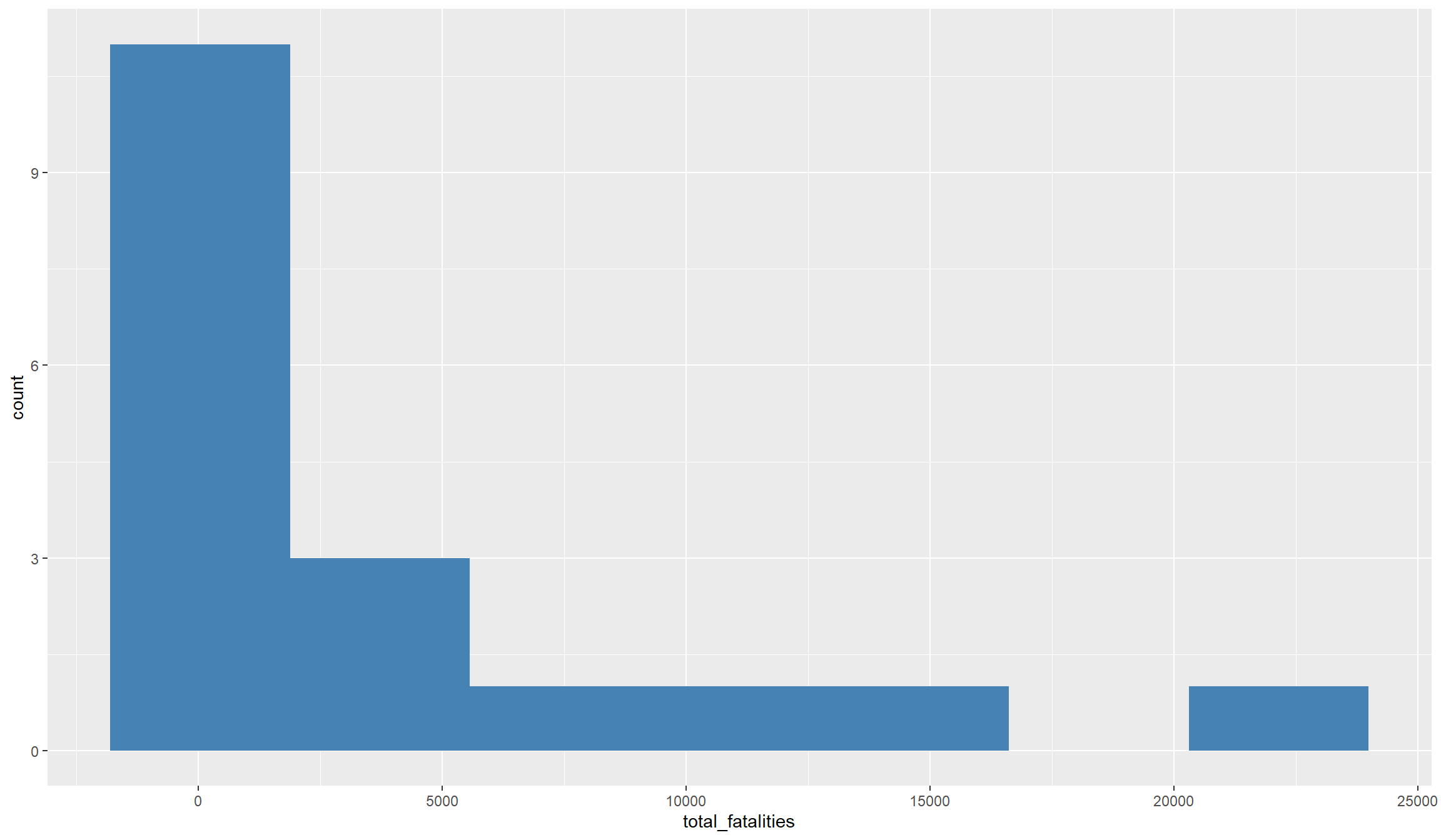
## Map with ggplot():
library(viridis)
ggplot(df_final, aes(fill=total_fatalities)) + geom_sf() +
      scale_fill_viridis_c(option="A",direction=-1)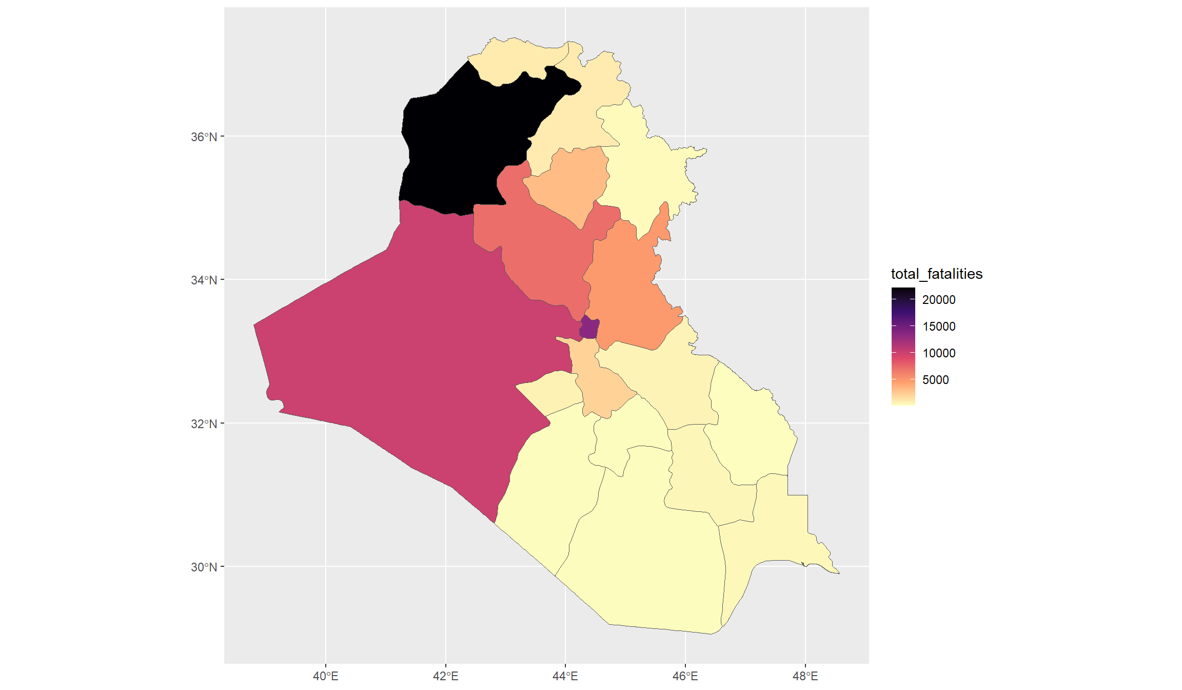
ggplot() quickly explained
The code snippet above uses ggplot() from the tidyverse package to produce a histogram and a map of the number of fatalities in our dataset.
More Details on Histograms
Histograms give a very good insight into the distribution of continuous variables. It divides the full range of the data into equally sized bins (you can control either the number or size of bins with the binwidth= or bins= argument in the geom_histogram function). Within each bin, it then counts the number of observations that fall into this bin, and then plots the relative frequency, i.e., the share of observations that fall into a bin.
The syntax of ggplot() is similar to the general tidyverse syntax, but has a couple of specialties.
You always need to start by defining the plotting parameters inside the ggplot() function itself. You first must define the object from where to take the data to plot (for us, this is df_final). Then, you must define the plotting parameters, also called aesthetics, inside the aes() function, which comes inside the ggplot() function.
The required aesthetics depend on the type of plot you want to make. Usually, we need to define two axis with x= and y=. For a histogram, we only need to define the x= argument, i.e., the variable for which we want to get the histogram. The y-axis will be by default the variable’s frequency because this is what histograms do. So we do not need to specify a variable here.
For the map, it is even more unusual. Here, we do not need to specify any axis, because the x- and y- axes will be our coordinates. Instead, we define the variable we want to display in the fill= argument. This tells R to display our variable as the filling colors of the shapefile’s polygons.
Afterwards, we can close the ggplot() function and continue with a +. In fact, ggplot() allows you to combine as many commands as you want by adding a + each time over and over.
The first additional parameter you should define is the type of plot. Above, this is geom_histogram() for a histogram, and geom_sf() in the second plot for a map. Inside these functions, we can specify additional things, like the (filling) color or the number of bins for a histogram.
These are the parameters you must specify. Afterwards, you can adjust the plot as much as you want by adding additional features with a +. Above, we used for example the scale_fill_viridis_c() function to choose a color palette for our map. Check out the function’s help file to see what color palettes and other things you can choose.
As you can see from the histogram, the variable is pretty skewed, i.e., we have many observations with comparatively little fatalities, and a handful of observations with very high number of fatalities. That makes it difficult to really grasp the variation that is in the data.
In an empirical analysis, we can account for that either by using specific count data models like Poisson and Negative Binomial regressions, or by categorizing the conflict variable, e.g. into an indicator variable.
For visualization, we also have two options to improve our graphs:
- Taking the logarithm smooths the distribution and moves the outliers closer to the rest.
- Categorizing our variable by ranking provinces from low to high conflict intensity.
Let’s compare both options. Note however that under option 2, we essentially switch to a categorical variable. This will slightly impact our graphical choices as we a) have to move from a histogram to a barplot and b) adjust the color scheme in our map to discrete.
# Take the logarithm
df_final$ln_fatalities <- log(1+df_final$total_fatalities)

## Categorizing with the cut() function.
df_final$conflict_intensity <- as.factor(cut(df_final$total_fatalities,
        breaks=c(-1,50,500,5000,max(df_final$total_fatalities))))

## Histogram with log variable:
ggplot(df_final, aes(x=ln_fatalities)) +
  geom_histogram(bins=20,fill="steelblue")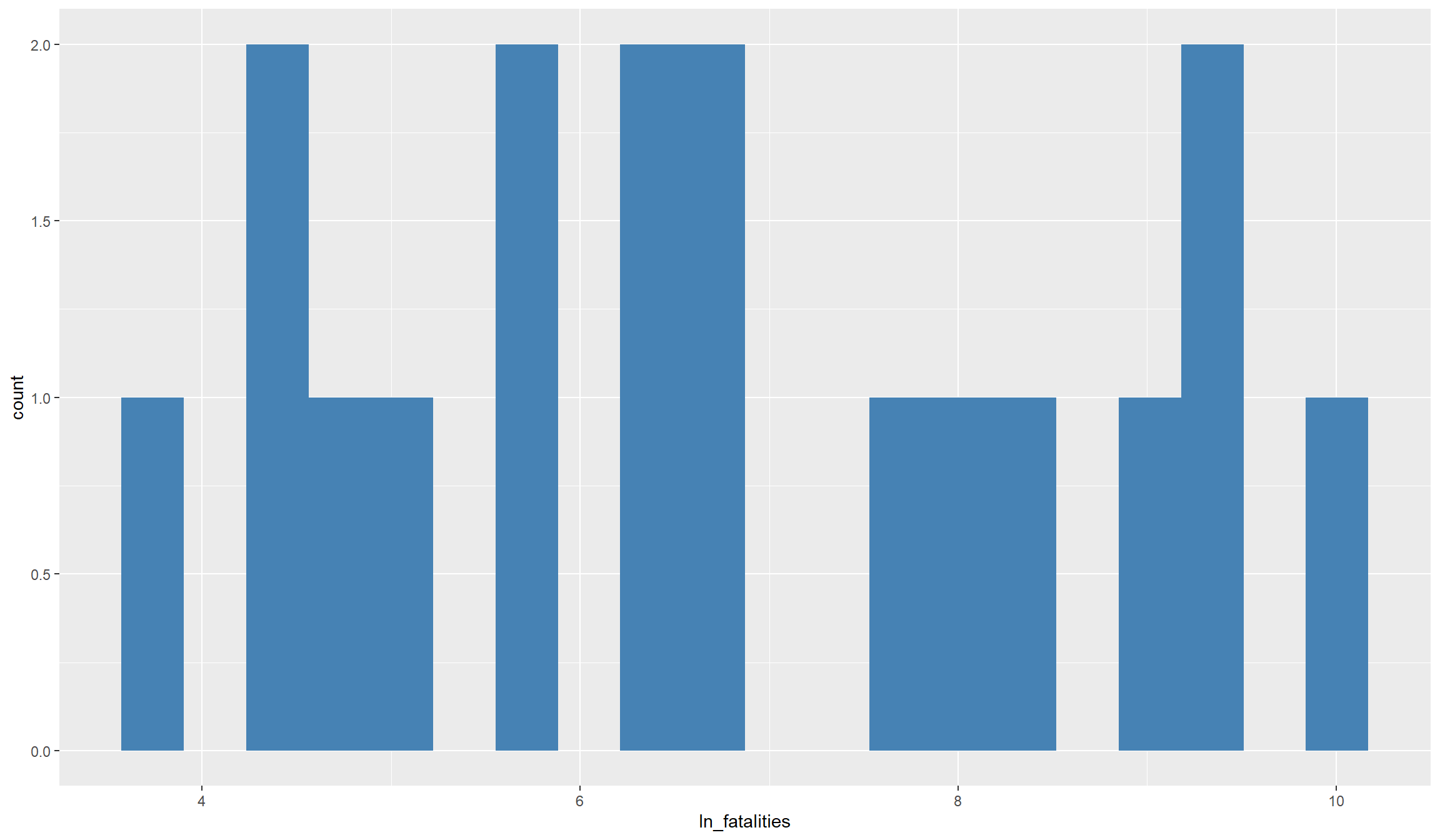
## Barplot with discrete variable:
ggplot(df_final, aes(x=conflict_intensity)) +
  geom_bar(fill="steelblue") + labs(x="Conflict Category, (from,to]",y="#Observations")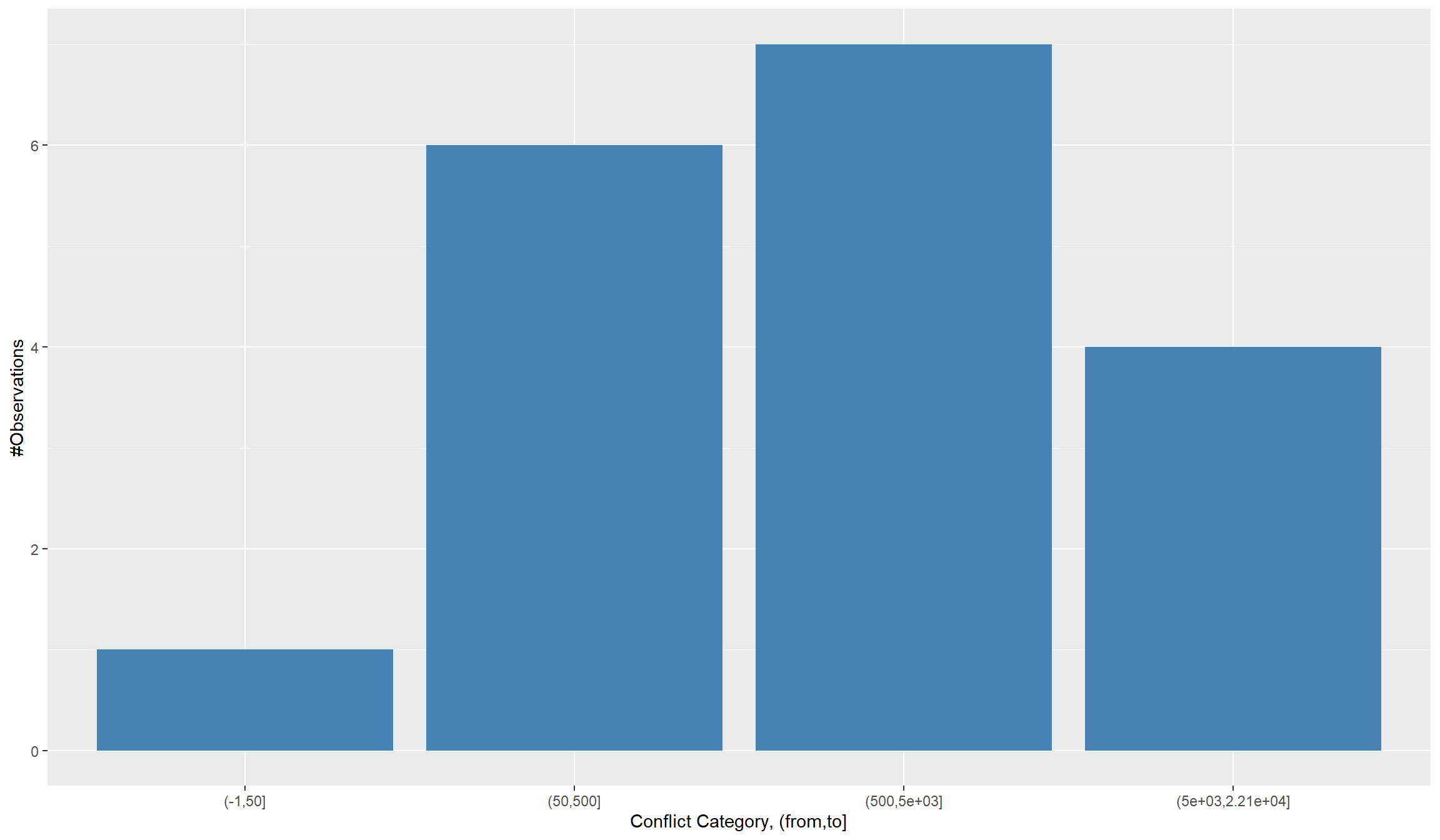
More Details on creating categorical variables with cut()
We converted our continuous total_fatalities variable to the categorical variable conflict_intensity. Instead of measuring the exact number of fatalities, this categorical variable will just indicate whether an observation is in the category of, e.g., very low or very high fatalities.
Our conversion centers around the cut() function, where we define how to split up the continuous variable into categories using the breaks= argument. Here, we defined our cut breaks with the sequence breaks=c(-1,50,500,5000,max(df_2015$total_fatalities)). This is, we defined a vector (with c()), which starts at -1 and moves up in irregular steps of our choosing up to the maximum number of events in our dataset.
It is important to start at some negative value, even though our count variable is bound downwards at zero. This is because the breaks define non-inclusive sets, so e.g. “0” would indicate “anything above zero”. This means that all our zeros would not receive a category, unless we start the lowest category somewhere below zero.
Background on the logarithm
It is common practice to transform skewed continuous variables with a logarithm. This brings their (often log-normal) distribution closer to a normal distribution, which we usually want for analysis and visualization.
Note however that we can not just take the logarithm of the variable. We have many zeros in the data (which is one reason for the variables being skewed), which come from all the provinces that did not see any violence in a year. The problem is though that the logarithm is not defined for non-positive numbers. Therefore, just taking the logarithm of the variable would return missing values for all observations that currently are zeros.
To circumvent that problem, we add a \(+1\) to the variable before logging it. This will only marginally change the distribution. However, quite conveniently the logarithm of \(1\) is \(0\), in effect giving us back all our zero values.
There is no really correct way for selecting the cut-offs in the discrete variable. You can of course let R decide the cutoffs and just define the number of categories, or follow quantiles for the breaks. In the end, it is all about finding the best way to visualize the distribution of your data.
Let’s now also look at our maps with the recoded variables:
## Map with log variable:
ggplot(df_final, aes(fill=ln_fatalities)) + geom_sf() +
  scale_fill_viridis_c(option="A",direction=-1) + labs(title="Distribution of ln(1+Fatalities)")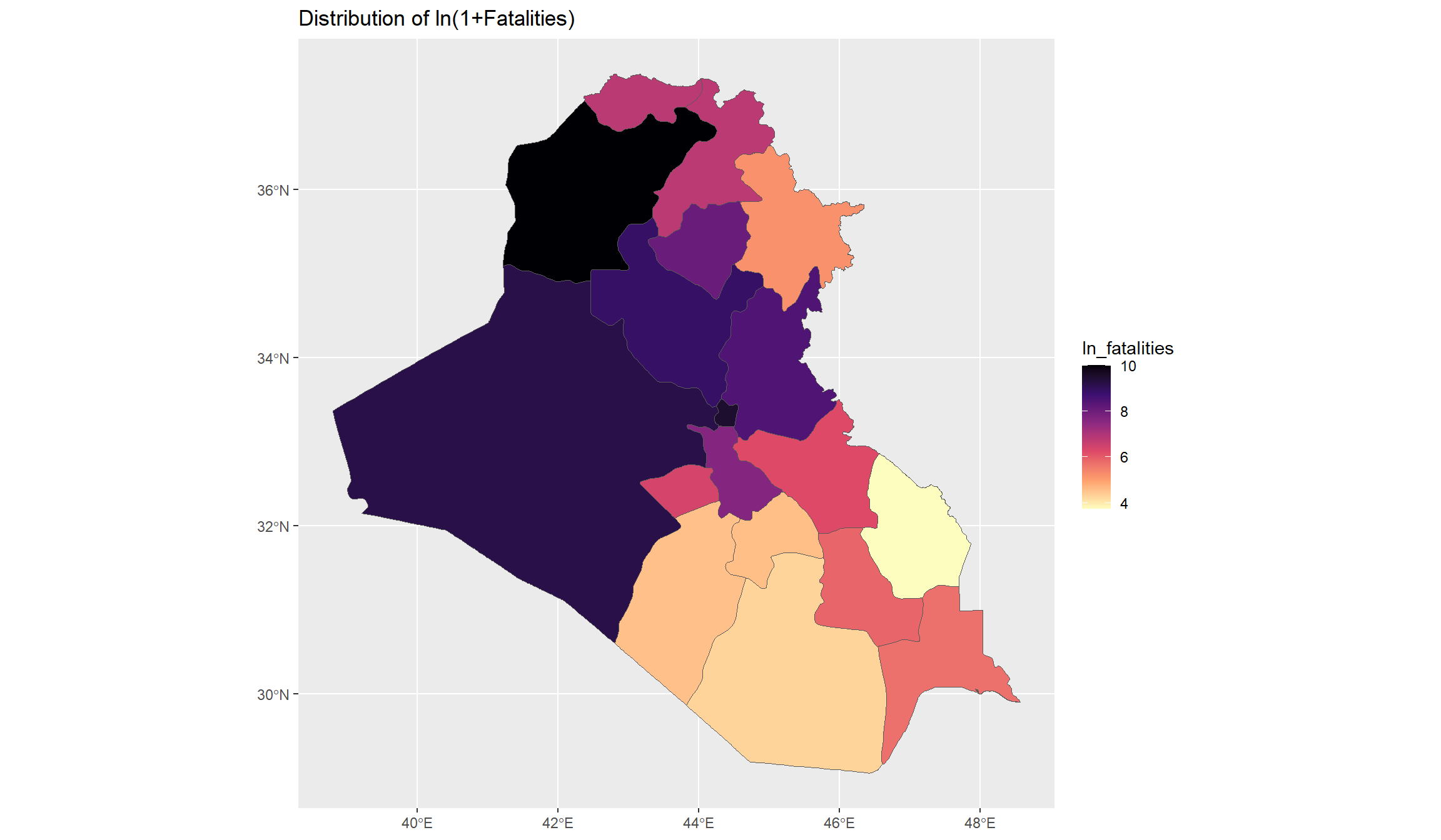
## Map with discrete variable - note the switch to viridis_d():
ggplot(df_final, aes(fill=conflict_intensity)) + geom_sf() +
  scale_fill_viridis_d(option="A",direction=-1) + labs(title="Distribution of Conflict Categories")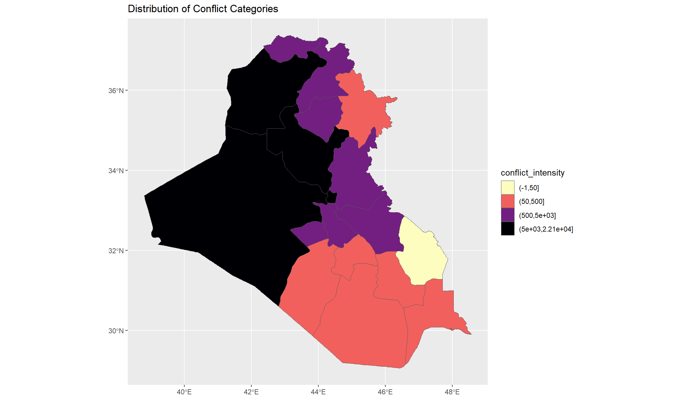
These maps give us a good overview of conflict-related fatalities that occurred in Iraq between 2010 and 2022. Let’s now have a look at the time dimension. Initially, we wanted to see whether we recognize the rise of the Islamic State in Iraq’s conflict data. Since ISL declared their caliphate in Iraq in 2014, we would expect that the conflict trend undergoes a switch around that time.
Let’s first look at the overall time dimension. We’ll turn back to our panel dataset in the df object for this. Do we see a trend break in the time series of fatalities? Note that we need to collapse our dataset to the year level to look at the national variation over time. We will use our old friends group_by() and summarize() for that again:
df_year <- df %>%
  group_by(year) %>%
  summarize(fatalities = sum(total_fatalities)) %>%
  mutate(ln_fatalities = log(1+fatalities))

## Plot Time Series:
ggplot(df_year, aes(x=year,y=ln_fatalities)) + geom_line() +
  scale_x_continuous(breaks = seq(2010,2022,2)) +
  theme_bw() + labs(y = "ln(#Fatalities)")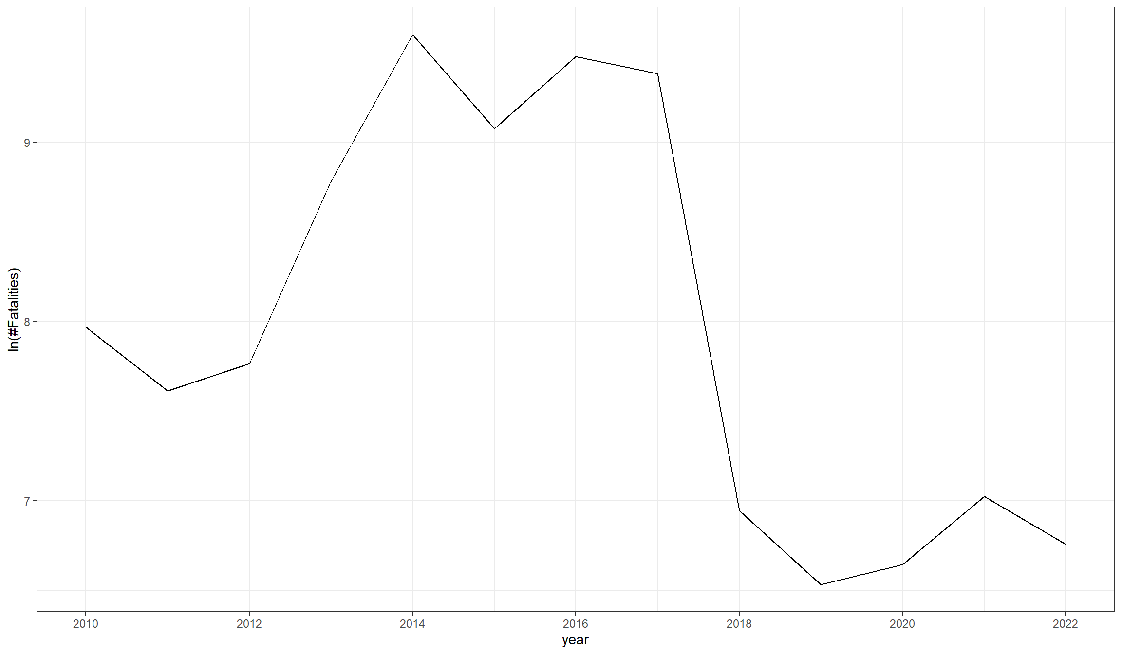
Do you notice the increase in violence in 2013 and 2014? Seems like the arrival of ISL in Iraq did indeed contribute to a further escalation of violence. To test this hypothesis even further, we could look into the raw conflict data and display violence by actor. We will work with raw conflict event data in another tutorial (LINK HERE?).
Step 6: Simple Regression Analysis
To close our tutorial, we want to do a simple regression analysis. This analysis will investigate whether the amount of violence in a province correlates with precipitation or tree coverage in a province. We will keep the analysis short, because we dive deeper into regression analysis in our second tutorial on Madagascar.
To run a regression in R, it is convenient to use the feols() function from the fixest package. The syntax is pretty easy. We call our dependent variable, and then declare after ~ on what explanatory variables we want to regress this dependent variable. The only thing left is to name the dataset that holds these variables. In addition, we will add the se=hetero argument to compute heteroskedasticity-robust standard errors.
We will run three different regressions, and expect each regression’s output using the summary() function. We will first regress the logarithm of fatalities on precipitation, then on tree coverage, and then finally on both together:
library(fixest) # To use the feols() function for our regressions.

r1 <- feols(ln_fatalities ~ precip_sum, se="hetero", data = df_final)
summary(r1)
OLS estimation, Dep. Var.: ln_fatalities
Observations: 18
Standard-errors: Heteroskedasticity-robust
Estimate Std. Error t value Pr(>|t|)
(Intercept) 6.066072 0.675861 8.97532 1.2091e-07 ***
precip_sum 0.000049 0.000036 1.37833 1.8707e-01
---
Signif. codes: 0 '***' 0.001 '**' 0.01 '*' 0.05 '.' 0.1 ' ' 1
RMSE: 1.76558 Adj. R2: 0.0603r2 <- feols(ln_fatalities ~ tree_cover, se="hetero", data = df_final)
summary(r2)OLS estimation, Dep. Var.: ln_fatalities
Observations: 18
Standard-errors: Heteroskedasticity-robust
Estimate Std. Error t value Pr(>|t|)
(Intercept) 6.979065 0.467187 14.93847 8.1265e-11 ***
tree_cover -0.000462 0.000078 -5.88594 2.2998e-05 ***
---
Signif. codes: 0 '***' 0.001 '**' 0.01 '*' 0.05 '.' 0.1 ' ' 1
RMSE: 1.73608 Adj. R2: 0.091436r3 <- feols(ln_fatalities ~ precip_sum + tree_cover, se="hetero", data = df_final)
summary(r3)OLS estimation, Dep. Var.: ln_fatalities
Observations: 18
Standard-errors: Heteroskedasticity-robust
Estimate Std. Error t value Pr(>|t|)
(Intercept) 6.317655 0.678256 9.31457 1.2612e-07 ***
precip_sum 0.000045 0.000036 1.25355 2.2919e-01
tree_cover -0.000431 0.000077 -5.59984 5.0669e-05 ***
---
Signif. codes: 0 '***' 0.001 '**' 0.01 '*' 0.05 '.' 0.1 ' ' 1
RMSE: 1.63556 Adj. R2: 0.139846Our regressions show a significantly negative correlation between fatalities and tree coverage. Provinces with more ha covered by trees saw significantly less conflict fatalities. We do not see a significant correlation between fatalities and precipitation. Be however careful how you interpret this finding. The significant correlation does not tell us that more trees cause less violence. Instead, many other variables that we did not account for, e.g. urbanization and population density, might correlate with violence and tree coverage.