Overview
mapme.biodiversity can be used to simply download a number of spatial resources and then conduct a custom analysis with that data. This tutorial shows how to access the downloaded data and conducting a small example analysis. For the scope of this tutorial, we are interested in analyzing fire intensities in the Serengeti National Park (NP), Tanzania. We are going to use mapme.biodiversity to download a fire detection product based on the MODIS satellites distributed by NASA and then conduct a fairly simple analysis of fire intensities within the national park.
Downloading data
First, we start by loading the required packages needed for the analysis.
library(sf)
library(rgl)
library(wdpar)
library(dplyr)
library(purrr)
library(units)
library(stringr)
library(ggplot2)
library(spatstat)
library(lubridate)
library(mapme.biodiversity)
Next, we create a directory to write our data to. We keep the path to this directory in a variable, because we are going to need it later to access the data.
data_dir <- "assets/data"
dir.create(data_dir, recursive = TRUE, showWarnings = FALSE)
We are using the wdpar package to download the data
base of protected areas in Tanzania and then subset it to the Serengeti
NP. Note, that we cast the geometry to "POLYGON" because
that type of geometry is actually expected by
mapme.biodiversity.
data <- wdpa_fetch("Tanzania", download_dir = data_dir)
aoi <- data[data$NAME == "Serengeti National Park", ]
aoi <- st_cast(aoi[1, ], "POLYGON")
In the next code chunk, we specify the output directory where the data will be downloaded to.
aoi <- mapme_options(outdir = data_dir, verbose = TRUE)We are now ready to actually download the data. Note, that running
the next code chunk actually takes significant time because the
nasa_firms resource is a rather large data set.
aoi <- get_resources(aoi, get_nasa_firms(years = 2010:2020, instrument = "MODIS"))The nasa_firms data set as processed by the
mapme.biodiversity package is collection of points stored
in a GeoPackage for each year of observation indicating the detection of
a fire with an associated confidence level of the detection. Follow the
resources linked in help(nasa_firms) to find out more about
the data.
After the download has completed, we can find the data in the
data_dir we specified earlier when constructing the
portfolio. There will be a new subfolder for each requested resource
with the same name.
gpkgs <- list.files(file.path(data_dir, "nasa_firms"),
  pattern = ".gpkg", full.names = TRUE
)
nasa_firms <- map_dfr(gpkgs, function(x) {
  read_sf(x, wkt_filter = st_as_text(st_as_sfc(st_bbox(aoi))))
})
nasa_firms <- nasa_firms[unlist(st_contains(aoi, nasa_firms)), ]
Since the nasa_firms data is a global data set but we
are only interested in the fires observed in the Serengeti NP, we apply
one filter when reading in the data to contain only points within the
bounding box of our AOI. Then we apply another filter to subset to
points that actually fall within the polygon.
That’s it! We actually accessed the original data that the
mapme.biodiversity package downloaded for us. Now we can
work with that data in a way that is suitable for our analysis. Follow
along if you want to learn how the nasa_firms resource can
be used to map fire intensity within the Serengeti NP!
EDA of fire events
First, let’s take a look at what we have. We select a confidence value of 50 to include only those detection with a higher probability of actually representing a fire event. Then, we construct a new variable representing the year of the observation and finally create a plot showing the spatio-temporal distribution of fire events in the Serengeti NP.
nasa_firms <- filter(nasa_firms, confidence > 50)
nasa_firms$year <- as.factor(year(nasa_firms$acq_date))

ggplot() +
  geom_sf(data = aoi, inherit.aes = TRUE) +
  geom_sf(data = nasa_firms, alpha = .1, color = "#f18e26") +
  coord_sf(expand = FALSE) +
  theme_classic() +
  theme(axis.text.x = element_text(angle = 90)) +
  scale_x_continuous(breaks = seq(from = 34.0, to = 35.0, by = .5)) +
  facet_wrap(~year, nrow = 2, switch = "x")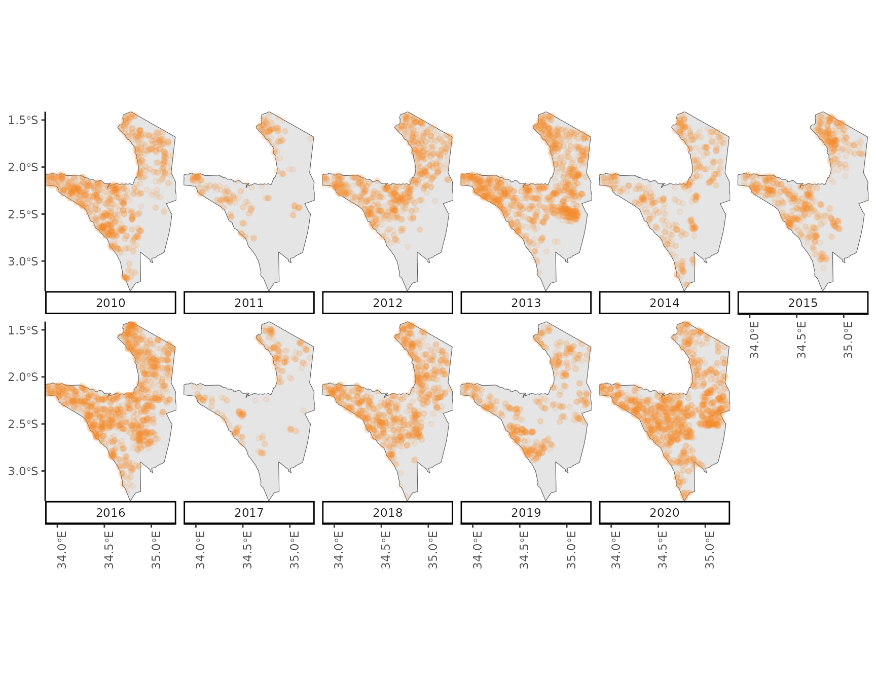
Visually, it seems there is a gradient with higher numbers of fires detected in the North-East of the National Park towards lower numbers in the South-West of the park. Also, during some years substantially fewer fires seem to occur compared to other years.
Let’s confirm that last observation by plotting a barplot of the numbers of fires for every years. We find the most fires occurred during 2016 and 2020 while the lowest numbers were observed in 2017 and 2011. The difference between the highest and lowest observed fires is 1270 fires while the average number of fires per year is 853
nasa_firms %>%
  st_drop_geometry() %>%
  ggplot() +
  geom_bar(aes(as.factor(year)), fill = "#f18e26") +
  theme_classic() +
  labs(x = "Year", y = "Count of fire events")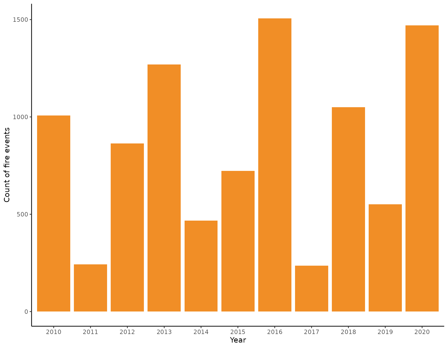
We now take a closer look at the intra-annual distribution of fires. For that, again, we construct a new variable indicating the month a certain observation was made.
nasa_firms$month <- factor(format(as.Date(nasa_firms$acq_date), "%b"),
  labels = month(1:12, label = TRUE, abbr = TRUE)
)

nasa_firms %>%
  st_drop_geometry() %>%
  ggplot() +
  geom_bar(aes(x = month), fill = "#f18e26") +
  theme_classic() +
  labs(x = "Month", y = "Count of fire events")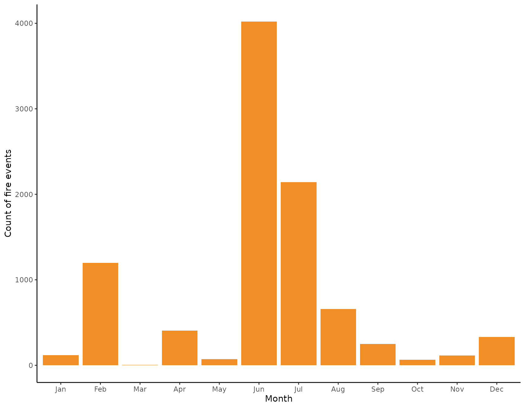
We see that there is a very clear seasonal pattern in the occurrences of fires with most fires observed in the months of June and July. During February and September there are also substantiall numbers of fires observer, but fewer than during the fire season. We now might look at the intra-annual distribution from a different angle by dividing a year into quarters starting with the month of March using the meteorological division of a year.
nasa_firms$quarter <- quarter(nasa_firms$acq_date, fiscal_start = 3)

nasa_firms %>%
  st_drop_geometry() %>%
  mutate(quarter = paste0("Q", quarter)) %>%
  ggplot() +
  geom_bar(aes(x = quarter), fill = "#f18e26") +
  theme_classic() +
  labs(x = "Quarter", y = "Count of fire events")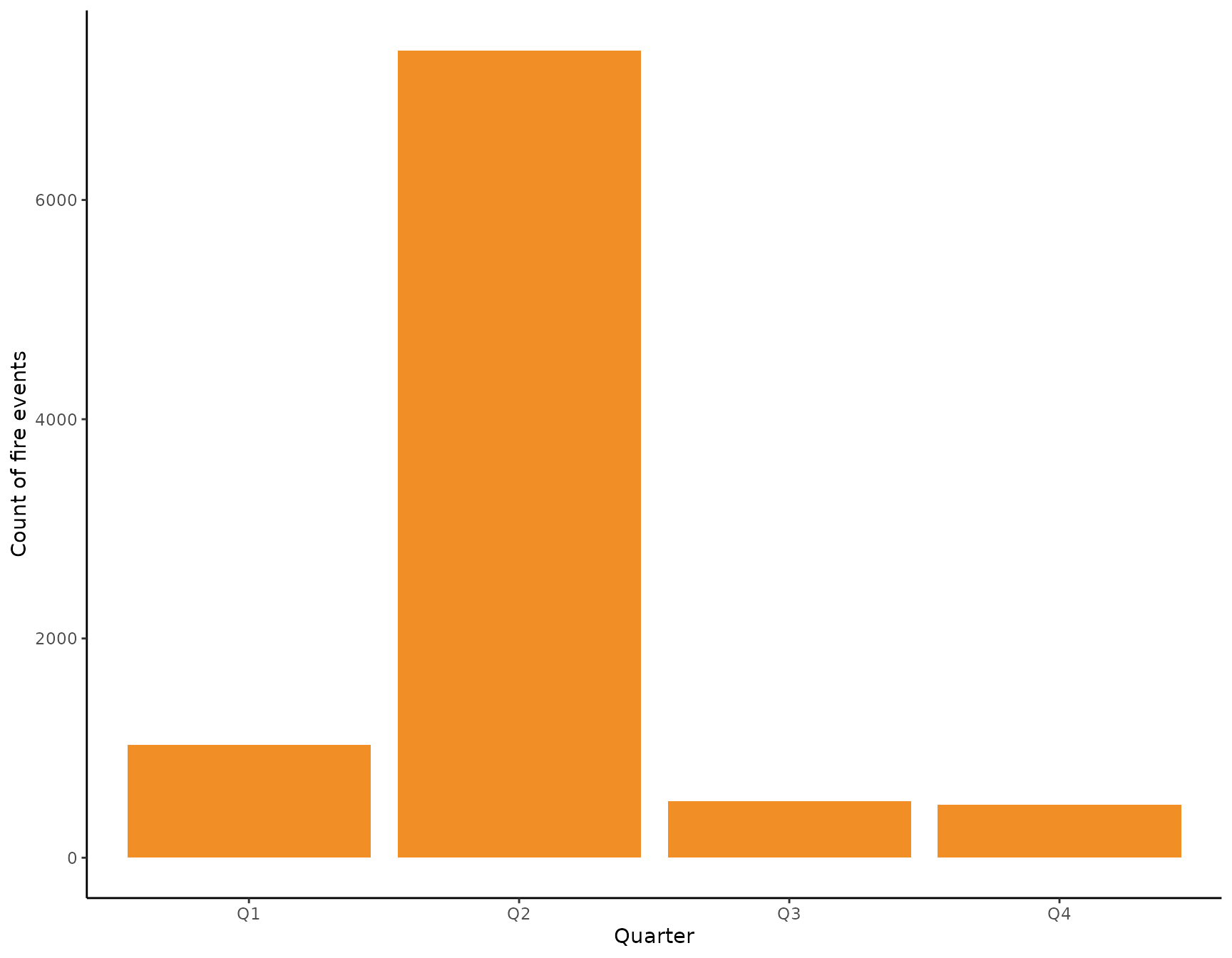
From this perspective, the most relevant quarter for analyzing fires in the Serengeti NP seems to be the second one spanning the months June, July, and August. We thus filter the data to only include fire observations from the second quarter and ignore the rest for the scope of this tutorial. Again, let’s have a spatial visualization of the data we are going to work with now.
nasa_firms <- filter(nasa_firms, quarter == 2)

ggplot() +
  geom_sf(data = aoi) +
  geom_sf(data = nasa_firms, alpha = .1, color = "#f18e26") +
  theme_classic() +
  theme(axis.text.x = element_text(angle = 90)) +
  scale_x_continuous(breaks = seq(from = 34.0, to = 35.0, by = .5)) +
  facet_wrap(~year, nrow = 2, switch = "x")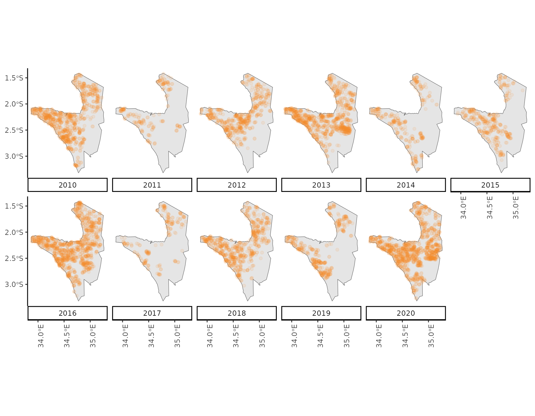
Kernel-based intensity estimation
From the visual interpretation of the data we might conclude that the
occurrence of fire events is spatially clustered with a tendency of more
fires observed in the North-East compared to the South-West. Imagine we
wanted to highlight areas where park rangers could watch emerging fires
more closely in order to prevent them from burning too large an area.
One approach to produce such an map is to use a kernel-based estimation
of the intensity of an observed point pattern. The spatstat
package provides a ton of functionality to work with point patterns, one
of which allows an empirical estimation of the intensity surface. For
that, we need to transform our data into a planar coordinate system and
plug it into a spatstat specific point-pattern object.
center <- st_coordinates(st_centroid(aoi))
laea <- paste0(
  "+proj=laea +lat_0=", center[2],
  " +lon_0=", center[1], " +x_0=0 +y_0=0"
)

aoi_laea <- st_transform(aoi, crs = laea)
fires_laea <- st_transform(nasa_firms, crs = laea)

ppp_fires <- as.ppp(c(st_as_sfc(aoi_laea), st_as_sfc(fires_laea)))
summary(ppp_fires)
#> Planar point pattern:  7361 points
#> Average intensity 5.646643e-07 points per square unit
#>
#> Coordinates are given to 3 decimal places
#> i.e. rounded to the nearest multiple of 0.001 units
#>
#> Window: polygonal boundary
#> single connected closed polygon with 401 vertices
#> enclosing rectangle: [-101678.14, 53378.67] x [-109059.06, 101908.44] units
#>                      (155100 x 211000 units)
#> Window area = 13036100000 square units
#> Fraction of frame area: 0.399
The summary of the Planar Point Pattern object shows some important information. First, there are 7361 points to begin with. These are distributed in an observation window which is constituted by the shape of the Serengeti NP and has a size of 13094316275 m². Thus, we obtain an average intensity for the whole national park of 5.62152299153907e-07 1/m² or 0.5622 1/km².
Let’s now test our assumption that the point pattern of fires
observed shows a tendency to clustering. For this we use
spatstat to estimate Ripley’s K function (see here
for more information). The K function compares an observed point pattern
to a simulation of a number of patterns that are the product of a
process showing complete spatially randomness (CSR). The statistic is a
count of the number of neighboring points within an increasing distance
r from each point in both the observed pattern an the simulated
ones. Comparing the two, simply put, allows to draw conclusions about
the behavior of the observed pattern at certain distances. If the
observed number of points at a specific distance is higher than the
expected one under CSR, the points tend to cluster together at that
distance. On the other hand, if there are less points in the spatial
neighborhood of a point than expected under CSR, there is an indication
of inhibition between points.
Note, that the estimation of K assumes that the point process is stationary - that is the intensity of fire events is homogeneous within the observation window. If intensity is in- homogeneous, we cannot be sure if the clustering is a result of the spatially varying intensity (first order effect) or because points attract each other to form clusters (second order effect). Since we are not interested in drawing conclusions about the process generating the observed pattern in this tutorial, we can accept this caveat.

We see that for the largest part of varying the distance r, the observed pattern seems to be more clustered than a CSR process (note, the units of r are meters). For very large values of r the observed pattern is within the expected range of CSR.
We now are interested in producing a map of estimated intensity which
informs us about the areas where fires are more likely to occur. For
this we are using a kernel-based empirical estimation of the observed
intensity. That means we are moving a kernel over the point pattern and
calculate the empirical intensity within the current kernel. The main
challenge here is to determine a bandwidth parameter sigma that
best fits the data. The standard approach in spatstat is to
solely determine sigma based on the size and the shape of the
observation window. We might achieve a better visualization with a
customized value for sigma. Since the point pattern shows a
tendency towards clustering, we apply a simple heuristic to derive a
value for sigma. We calculate the difference between the
observed K and the K values under CSR. Then, we determine at which
spatial distance r the difference between the two is maximal.
To get sigma we than simply take half the value of that
distance.
diff <- k_env$obs - k_env$theo
sigma <- k_env$r[which.max(diff)] / 2
This indicates that the distance between the observed and simulated K
is maximal at a distance of 14050 so that our bandwidth for the kernel
estimation of the intensity is 7025. We can now use the
density() function to apply a kernel-based estimation of
intensity with our custom sigma value.
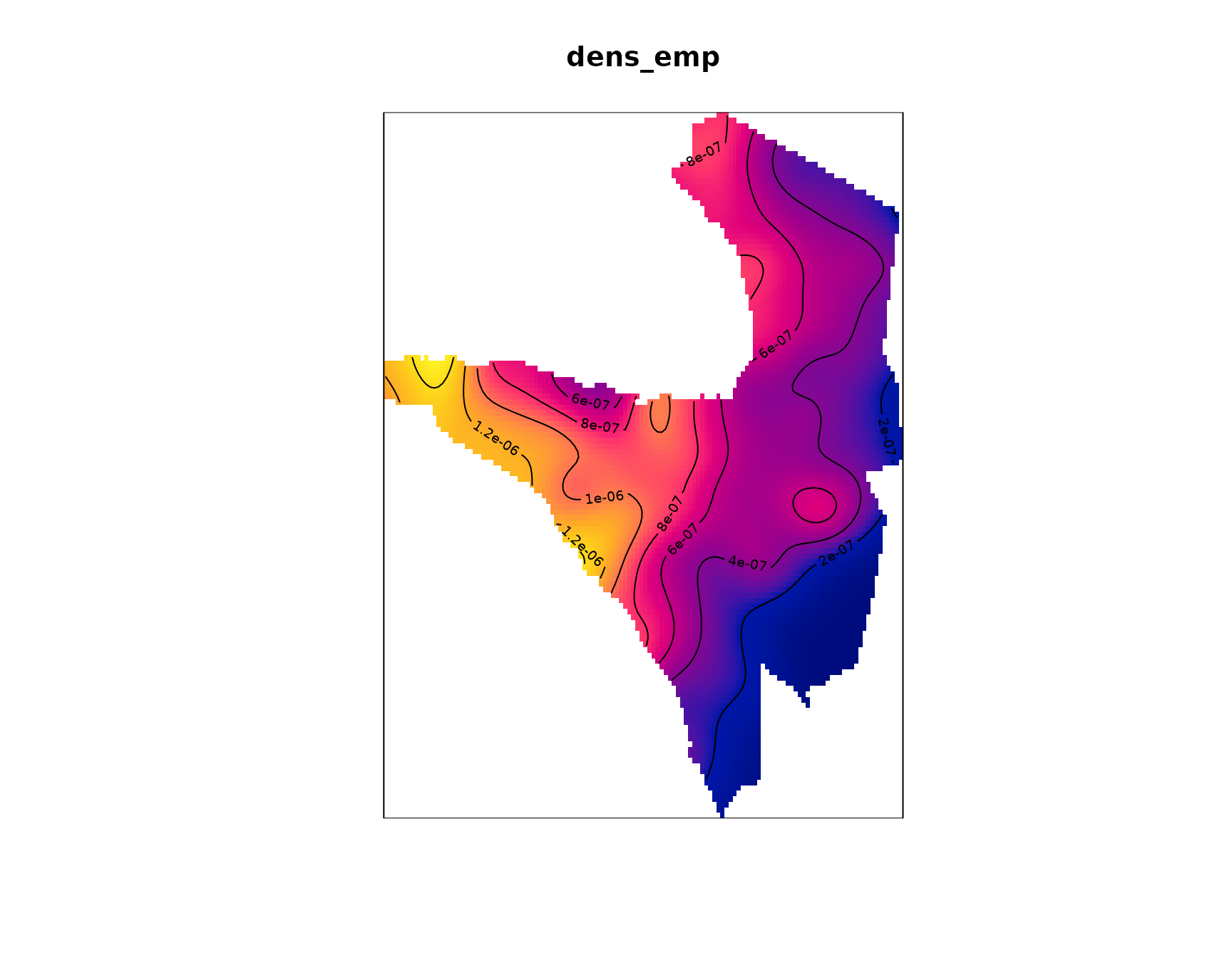
Let’s make a quick sanity check if the empirical intensity matches the point pattern. For that, remember that the units for the intensity is fires per m². We thus need to multiply the sum of the pixel values by their spatial resolution.
res <- dens_emp$xstep * dens_emp$ystep
sum(dens_emp) * res
#> [1] 7384.578
nrow(nasa_firms)
#> [1] 7361
While not being actual identical values, the kernel-based estimate of the number of events is close enough to the observed one. We now might also include a 3D animation of the intensity surface to allow an even better investigation.
map2color <- function(x, pal, limits = range(x, na.rm = TRUE)) {
  pal[findInterval(x, seq(limits[1], limits[2], length.out = length(pal) + 1),
    all.inside = TRUE
  )]
}

pal <- colorRampPalette(c("blue", "yellow", "red"))
cols <- map2color(dens_emp$v,
  pal = pal(100),
  limits = c(
    min(dens_emp$v, na.rm = TRUE),
    quantile(dens_emp$v, .75, na.rm = TRUE)
  )
)

persp3d(dens_emp$v,
  col = cols, xlab = "X", ylab = "Y", zlab = "Fire Intensity",
  main = "Fire intensity for Q2", aspect = c(1, 1, .65)
)
control <- par3dinterpControl(spin3d(axis = c(0, 0, 1)), 0, 12, steps = 40)
rglwidget() %>% playwidget(control, step = 0.01, loop = TRUE, rate = 0.5)